React Carousel made out of Shadcn/ui Components only
- 2 1
- May 23, 2024
- 3 min read

Updated: Jul 11, 2024
A carousel of images made of only shadcn/ui components, for Next.js React applications.

Screenshot of the carousel in action
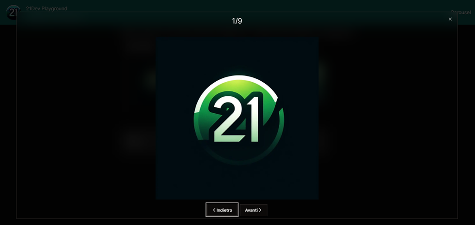
Screenshot of the expanded mode
Here you can see it in action: https://21devplayground.vercel.app/
Tutorial:
First of all, copy the snippet below and paste it in a new Carousel.tsx component in your code:
//Carousel.tsx
'use client'
import * as React from "react";
import Image from "next/image";

import { Dialog, DialogContent, DialogHeader, DialogTrigger } from "@/components/ui/dialog";
import { ScrollArea, ScrollBar } from "@/components/ui/scroll-area";
import { Button } from "@/components/ui/button";

import { Icon } from "@iconify/react/dist/iconify.js";

// Static image paths
const staticImages = [
  "/images/image1.jpg",
  "/images/image2.jpg",
  "/images/image3.jpg",
  "/images/image4.jpg",
  "/images/image5.jpg",
  "/images/image6.jpg",
  "/images/image7.jpg",
  "/images/image8.jpg",
  "/images/image9.jpg",
];

// Carousel component
export default function Carousel() {
  // State variables
  const [selectedImage, setSelectedImage] = React.useState(staticImages[0]);
  const [selectedImageIndex, setSelectedImageIndex] = React.useState(0);

  // Function to handle next image
  const handleNext = () => {
    const nextIndex = (selectedImageIndex + 1) % staticImages.length;
    setSelectedImage(staticImages[nextIndex]);
    setSelectedImageIndex(nextIndex);
  };

  // Function to handle previous image
  const handlePrev = () => {
    const prevIndex = (selectedImageIndex - 1 + staticImages.length) % staticImages.length;
    setSelectedImage(staticImages[prevIndex]);
    setSelectedImageIndex(prevIndex);
  };

  // Render
  return (
    <div className="w-[90vw] sm:w-[60vw] md:w-[40vw]  sm:px-4 mx-auto pt-6">
      {/* Scrollbar title */}
      <span className='text-2xl font-medium' style={{ color: 'var(--foreground)' }}>Scrollbar</span>

      {/* Scrollable area */}
      <ScrollArea className="whitespace-nowrap rounded-md border shadow-inner mt-2" style={{ backgroundColor: 'var(--background)', backdropFilter: 'blur(10px)', borderColor: 'var(--border)' }}>
        <div className="flex p-8 ">
          {/* Image gallery */}
          {staticImages.map((image, index) => (
            <Dialog key={index}>
              <DialogTrigger asChild>
                <figure className="shrink-0">
                  <div className="overflow-hidden border shadow-2xl rounded-md mr-4" style={{ borderColor: 'var(--border)' }}>
                    <div className="relative shadow-lg">
                      {/* Image */}
                      <Image
                        src={image}
                        alt={'Image ' + (index + 1)}
                        className="aspect-square h-fit w-fit object-cover transition-opacity opacity-0 duration-100 cursor-pointer"
                        width={100}
                        height={100}
                        onClick={() => {
                          setSelectedImage(image);
                          setSelectedImageIndex(index);
                        }}
                        onLoad={(event) => {
                          const target = event.target as HTMLImageElement;
                          target.classList.remove('opacity-0');
                        }}
                      />
                    </div>
                  </div>
                </figure>
              </DialogTrigger>

              {/* Dialog content */}
              <DialogContent className="grid-rows-carousel h-[90%] max-w-[85%] p-2" style={{ color: 'var(--foreground)', backgroundColor: 'var(--card)', backdropFilter: 'blur(20px)' }}>
                {/* Dialog header */}
                <DialogHeader className="mx-auto h-12">
                  <span className="text-2xl font-light my-auto">{selectedImageIndex + 1}/{staticImages.length}</span>
                </DialogHeader>

                {/* Image display and navigation */}
                <div className="flex flex-col h-full justify-between items-center">
                  <div className="relative w-full h-full">
                    {/* Selected image */}
                    <Image
                      src={selectedImage}
                      alt="Selected Image"
                      fill={true}
                      className="max-h-[95%] max-w-full object-contain transition-opacity opacity-0 duration-75 m-auto"
                      onLoad={(event) => {
                        const target = event.target as HTMLImageElement;
                        target.classList.remove('opacity-0');
                      }}
                    />
                  </div>

                  {/* Navigation buttons */}
                  <div className="flex gap-2 justify-between items-center">
                    {/* Previous button */}
                    <Button variant='outline' className="cursor-pointer" onClick={handlePrev}>
                      <Icon icon='ooui:previous-ltr' width='14' height='14' />
                      Indietro
                    </Button>

                    {/* Next button */}
                    <Button variant='outline' className="cursor-pointer" onClick={handleNext}>
                      Avanti
                      <Icon icon='ooui:previous-rtl' width='14' height='14' />
                    </Button>
                  </div>
                </div>
              </DialogContent>
            </Dialog>
          ))}
        </div>

        {/* Scrollbar */}
        <ScrollBar orientation="horizontal" className="scrollbar-thumb scrollbar-track"/>
      </ScrollArea>
    </div>
  );
}
Another requirement is to have the images to place in the carousel
For the snippet, I used 9 images (image1, image2... image9) placed in the
public/images folderThis tutorial doesn't cover how to connect images from a database
Then
Go here https://ui.shadcn.com/docs and install
Dialog
ScrollArea
Button
These are the components that make up the Carousel.
In order to customize some elements like the scrollbar background and thumb, you should go directly in the shadcn components
app/components/ui/And modify from there the parameters.
You should have now a simple carousel with a scrollbar; in touch mode it will be a smoother experience.
Here is the github repo: https://github.com/21d3v/shadcn-carousel
Backstory: I made this carousel while developing an online real estate portal app ( https://21devteam.wixsite.com/21devteam/portfolio-collections/my-portfolio/website-interface-design ), and I immediately had the idea to publish it on the shadcn repo.
I procrastinated, and two months later, he updated the site with a new carousel component based on Embla.
Well, now we are here.
The carousel is the same as I coded in the project without any new improvement.
Here’s a list of my todos for this project:
Make it 100% aria-accessible and address everything else about accessibility
Create a loading spinner for the images when opened
Second version: only one image in the carousel, clickable and expandable, with next and previous buttons on the sides
Third version: like the actual version with images in a row, but instead of the scrollbar, two buttons that move a chunk of images based on the length of the displayed area and scrollable area.
Hope you enjoyed it; comment below with improvements or on the repo!
And follow me on twitter! https://x.com/X210030012X
Comments