Create a custom CRM card mapping system with Next.Js, React, CSS Flexbox, Typescript
- 2 1
- Jul 1, 2024
- 9 min read

Welcome, in this article we are going to talk about a card mapping system I developed for a CRM (Client Relationship Manager).
The original app was developed with Next 13, Redux, PostgreSQL and CSS with no style libraries. In this tutorial, we have removed Redux and added Typescript instead.
(Original project: https://21devteam.wixsite.com/21devteam/portfolio-collections/my-portfolio/vida-crm-and-company-database-in-nextjs-13)

Click here to go directly to the -> Tutorial
Basically, you can get leads (clients) from a database or an external source, and mapping them in your CRM.
This system can apply for a variety of purposes, like recipes, task managers, friends management systems, everything that needs ‘cards’ to be displayed.
We are going to use the following tools:
CSS (for flexbox, hovering and styling)
React 18 (we will write everything in JSX)
Typescript (every snippet is written with Typescript to make them type safe)
It will be hosted in my Next.Js playground, go see it in action: https://21devplayground.vercel.app/cards
The contacts will be hardcoded.
In order to connect the cards content to an external source I will write another article.
Why cards?
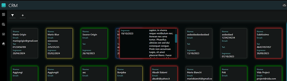
In many cases, cards offer a visually appealing way to display data. With the addition of a hovering effect, cards can make it easier to visualize notes, as they can be higher than rows in a table. For this particular application, cards were chosen because they were more attractive to the client.
What does hovering mean?
Hovering refers to the effect that occurs when you pass the cursor over a card. In this application, the hovering effect causes the cards to expand horizontally, revealing additional information that is too large to be displayed in the card's standard size.
What about the cards on the edges of the screen?
When cards are near the right edge of the viewport (screen), they may extend beyond the visible area, making them difficult to read. To address this, we use the getBoundingClientRect() method to determine when a card should expand to the left instead of the right. This ensures that the cards remain fully visible within the screen.
For touchscreen devices (smartphones in landscape mode or tablets), it functions exactly the same. When you press on a card, it expands, and the content can be scrolled inside. Touching outside of it, it minimizes the card.
I disabled this approach for phones. This is because the CRM was built to open a sidebar with more information when a card is actually clicked, so on phones it would just have been a useless overcomplication.
For now, let’s keep the cards as a single element, with only the hovering function associated, we will build the sidebar in another future article that I’ll link here when ready!
How to implement it:
At the end of the tutorial, you're directory structure should look like this:
src/
---app/
---public/
---components/
-----cards/
--------Card.tsx
--------CardsList.tsx
--------cardStyles.module.css
--------cardsListStyles.module.css
---data/
-----contacts.ts
---utils/
-----dateUtils.ts
Create a /data directory in the src directory (root directory) and create inside a ‘contacts.ts’ file, copy and paste this snippet:
// src/data/contacts.ts

interface Contact {
  id: number;
  acquisition_date: string;
  name: string;
  email: string;
  phone: string;
  notes: string;
  typology: string;
}

const contacts: Contact[] = [
  {
    id: 1,
    acquisition_date: "2023-06-27",
    name: "John Doe",
    email: "john.doe@example.com",
    phone: "123-456-7890",
    notes: "Lorem ipsum dolor sit amet, consectetur adipiscing elit. Lorem ipsum dolor sit amet, consectetur adipiscing elit. Lorem ipsum dolor sit amet, consectetur adipiscing elit.",
    typology: "Lead"
  },
  {
    id: 2,
    acquisition_date: "2023-07-15",
    name: "Jane Smith",
    email: "jane.smith@example.com",
    phone: "987-654-3210",
    notes: "Sed do eiusmod tempor incididunt ut labore et dolore magna aliqua. Sed do eiusmod tempor incididunt ut labore et dolore magna aliqua. Sed do eiusmod tempor incididunt ut labore et dolore magna aliqua.",
    typology: "Prospect"
  },
  {
    id: 3,
    acquisition_date: "2023-08-20",
    name: "Alice Johnson",
    email: "alice.johnson@example.com",
    phone: "654-321-9876",
    notes: "Ut enim ad minim veniam, quis nostrud exercitation ullamco laboris. Ut enim ad minim veniam, quis nostrud exercitation ullamco laboris. Ut enim ad minim veniam, quis nostrud exercitation ullamco laboris.",
    typology: "Client"
  },
  {
    id: 4,
    acquisition_date: "2023-09-12",
    name: "Bob Brown",
    email: "bob.brown@example.com",
    phone: "321-654-0987",
    notes: "Duis aute irure dolor in reprehenderit in voluptate velit esse. Duis aute irure dolor in reprehenderit in voluptate velit esse. Duis aute irure dolor in reprehenderit in voluptate velit esse.",
    typology: "No"
  },
  {
    id: 5,
    acquisition_date: "2023-10-01",
    name: "Charlie White",
    email: "charlie.white@example.com",
    phone: "456-789-0123",
    notes: "Cillum dolore eu fugiat nulla pariatur. Excepteur sint occaecat cupidatat. Cillum dolore eu fugiat nulla pariatur. Excepteur sint occaecat cupidatat. Cillum dolore eu fugiat nulla pariatur. Excepteur sint occaecat cupidatat.",
    typology: "Maybe"
  },
  {
    id: 6,
    acquisition_date: "2023-11-05",
    name: "David Green",
    email: "david.green@example.com",
    phone: "789-012-3456",
    notes: "Proident, sunt in culpa qui officia deserunt mollit anim id est laborum. Proident, sunt in culpa qui officia deserunt mollit anim id est laborum. Proident, sunt in culpa qui officia deserunt mollit anim id est laborum.",
    typology: "Lead"
  },
  {
    id: 7,
    acquisition_date: "2023-12-14",
    name: "Eve Black",
    email: "eve.black@example.com",
    phone: "012-345-6789",
    notes: "Quis autem vel eum iure reprehenderit qui in ea voluptate velit esse. Quis autem vel eum iure reprehenderit qui in ea voluptate velit esse. Quis autem vel eum iure reprehenderit qui in ea voluptate velit esse.",
    typology: "Prospect"
  }
];

export default contacts;
These are the fake contacts we are going to use for the cards
Create 2 new components, Card.tsx and CardsList.tsx and put them in the cards components directory ( src/components/cards/ ).
Create in the same directory 2 css modules: cardStyles.module.css add cardsListStyles.module.css and respectively copy and paste the following snippets inside of them:
cardStyles.module.css
/* src/components/cards/cardStyles.module.css */

.contact-card {
  font-size: 0.8em;
  overflow: hidden;
  height: 14em;
  padding: 0.5em;
  background-color: #091f1f;
  border: 1px solid #424a49 ;
  border-radius: 5px;
  box-shadow: 0em 0em 10px 2px #403f3670;
  cursor: pointer;
  transition: all 0.11s;
}
@media (max-width:786px) {
.contact-card {
  width: 25em !important;
}
}

.contact-card:hover {
  background-color: #040909;
  transition: all 0.2s;
  overflow-y: auto;
  z-index: 10;

}

.contact-card.active {
  background-color: #123333;
  transition: all 0.2s;
}


.labelCard {
font-weight: 500;
font-size: 0.9em;
color: #5f9d9d;
}

/* cardStyles.module.css */
.row-wrapper {
display: flex;
justify-content: space-between;
align-items: flex-start;
}

/* Properties regarding .info-wrapper, activated if row is hovered */

@media (min-width:980px) {
.row-wrapper:hover .info-wrapper {
  flex-grow: 0;
  flex-basis: 50%;
  overflow-x: hidden;
  overflow-y: auto;
  text-overflow: ellipsis;
  white-space: nowrap;
}
}

.notes-wrapper {
flex-grow: 0;
flex-basis: 50%;
display: flex; /* Set the wrapper as a flex container */
align-items: flex-start; /* Align the content vertically in the middle */
padding-left: 10px; /* Add some padding to create space between Name and Notes */

}

.notes-content {
display: flex; /* Set the content as a flex container */
flex-direction: column; /* Arrange the content in a column */
align-items: center; /* Align the content horizontally (center) */
justify-content: center; /* Align the content vertically (center) */
text-align: start; /* Center the text inside the Notes section */
white-space: pre-line;
}
And then the cardListStyles.module.css:
/* cardListStyles.module.css */

.contacts-wrapper {
  display: flex;
  flex-direction: column;
  flex-grow: 1; /* take remaining height */
  padding: 0 0 1em;
  overflow: hidden !important; /* Important to hide overflow */
  background-color: #042421;
  border-top: 1px solid #0d856d;
  border-bottom: 1px solid #0d856d;
}
.contacts-container {
  padding: 2.5em 1.3em 1.3em;
  display: flex;
  flex-wrap: wrap;
  overflow-y: auto; /* Enable vertical scrolling */
  justify-content: space-evenly;
  align-content: flex-start;
  gap: 2.7em;
  flex-grow: 1; /* take remaining height */
}
@media (max-width:786px) {
  .contacts-container {
    padding: 1em 1em 1em;
    gap: 1em !important;
  }
}
Create a utils directory and a dateUtils.ts file, copy the following code inside it:
// src/utils/dateUtils.ts

export function displayDate(dateString: any) {
  const date = new Date(dateString);
  return date.toLocaleDateString('it-IT', {
      year: 'numeric',
      month: '2-digit',
      day: '2-digit'
  });
}IMPORTANT: In your parent component, call the CardsList component. If you are using Next.Js, make sure to make the parent component a client component, writing ‘use client’ (with the quotation marks included) on top of the file (could be the page.tsx file where you call the component).
Copy the following code and write it into you CardsList component:
// src/components/cards/CardsList.tsx

import React, { useRef } from 'react';
import Card from './Card';
import crmStyles from '@/components/cards/cardsListStyles.module.css';
import contacts from '@/data/contacts'; // Import the contacts data

const CardsList: React.FC = () => {
  const parentRef = useRef<HTMLDivElement>(null);

  return (
    <div className={crmStyles['contacts-wrapper']}>
      <div ref={parentRef} className={crmStyles['contacts-container']}>
        {contacts.map((contact) => (
          <Card
            key={contact.id} //Id of each contact
            contact={contact} //the contact itself which carries the infos
            parentRef={parentRef}
            typology={contact.typology}
            onClick={() => {}} // No selection logic
          />
        ))}
      </div>
    </div>
  );
};

export default CardsList;
Same goes for the Card component:
// src/components/cards/Card.tsx

import React, { useState, useRef, useEffect, useCallback, RefObject } from 'react';
import { displayDate } from '@/lib/dateUtils';
import cardStyles from '@/components/cards/cardStyles.module.css';

interface Contact {
  acquisition_date: string;
  name: string;
  email: string;
  phone: string;
  notes: string;
}

interface CardProps {
  contact: Contact;
  parentRef: RefObject<HTMLDivElement>;
  typology: string;
  onClick: () => void;
}

const Card: React.FC<CardProps> = ({ contact, parentRef, typology, onClick }) => { // Removed isSelected from the destructuring
  const [isHovered, setIsHovered] = useState(false);
  const [isCardResized, setIsCardResized] = useState(false);
  const [isViewportSmall, setIsViewportSmall] = useState(false);
  const resizeTimeout = useRef<NodeJS.Timeout | null>(null);

  const handleResize = useCallback(() => {
    setIsViewportSmall(window.innerWidth <= 768);
    setIsHovered(false);
    setIsCardResized(false);
  }, []);

  useEffect(() => {
    setIsViewportSmall(window.innerWidth <= 768); // Set initial value
    window.addEventListener('resize', handleResize);
    return () => window.removeEventListener('resize', handleResize);
  }, [handleResize]);

  const getColorBasedOnTypology = useCallback((state: string) => {
    switch (state) {
      case 'Lead': return { borderColor: '#424a49', boxShadowColor: '#403f3670' };
      case 'Prospect': return { borderColor: '#d9cc53', boxShadowColor: '#c4b73b8f' };
      case 'Client': return { borderColor: 'green', boxShadowColor: 'green' };
      case 'No': return { borderColor: '#d33030', boxShadowColor: '#ad2626' };
      case 'Maybe': return { borderColor: '#3370e1', boxShadowColor: '#2a6cc165' };
      default: return { borderColor: '#424a49', boxShadowColor: '#403f3670' };
    }
  }, []);

  const { borderColor, boxShadowColor } = getColorBasedOnTypology(typology);

  const [shouldExpandLeft, setShouldExpandLeft] = useState(false);

  const handleMouseEnter = useCallback((e: 			  React.MouseEvent<HTMLDivElement>) => {
    if (!isViewportSmall) {
      const cardRect = e.currentTarget.getBoundingClientRect();
      const containerRect = parentRef.current?.getBoundingClientRect();

      const containerCenter = containerRect ? containerRect.left + containerRect.width / 2 : 0;
      setShouldExpandLeft(cardRect.left > containerCenter);

      setIsHovered(true);
      if (resizeTimeout.current) clearTimeout(resizeTimeout.current);
      resizeTimeout.current = setTimeout(() => setIsCardResized(true), 500);
    }
  }, [isViewportSmall, parentRef]);

  const handleMouseLeave = useCallback(() => {
    if (!isViewportSmall) {
      setIsHovered(false);
      if (resizeTimeout.current) clearTimeout(resizeTimeout.current);
      setIsCardResized(false);
    }
  }, [isViewportSmall]);

  const acquisitionDate = contact.acquisition_date ? displayDate(contact.acquisition_date) : "N/A";

  return (
    <div
      className={cardStyles['contact-card']}
      onClick={onClick}
      onMouseEnter={handleMouseEnter}
      onMouseLeave={handleMouseLeave}
      style={{
        borderColor,
        boxShadow: `0em 0em 10px 2px ${boxShadowColor}`,
        width: isCardResized ? '24em' : '11em',
        marginLeft: shouldExpandLeft && isCardResized ? '-13em' : '',
        marginRight: !shouldExpandLeft && isCardResized ? '-13em' : '',
      }}
    >
      <div className={cardStyles['row-wrapper']}>
        <div className={cardStyles['info-wrapper']}>
          <span className={cardStyles['labelCard']}>Name:</span>
          <br />
          {contact.name}
          <br />
          <span className={cardStyles['labelCard']}>Email:</span>
          <br />
          {contact.email}
          <br />
          <span className={cardStyles['labelCard']}>Phone:</span>
          <br />
          {contact.phone}
          <br />
          <span className={cardStyles['labelCard']}>Entered:</span>
          <br />
          {acquisitionDate}
        </div>
        {isHovered && (
          <div className={cardStyles['notes-wrapper']}>
            <div className={cardStyles['notes-content']}>
              <span className={`${cardStyles['labelCard']} ${cardStyles['label-notes']}`}>
                Notes:
              </span>
              <br />
              {contact.notes}
            </div>
          </div>
        )}
      </div>
    </div>
  );
};

export default Card;
Things to notice and explanations:
In the CardsList component, we wrote
const parentRef = useRef<HTMLDivElement>(null); and then we passed it down as a prop to the Card component.
This let’s as bound a certain element to this parentRef, specifically the contacts-container, when we attach the parentRef to the div:
<div ref={parentRef} className={crmStyles['contacts-container']}>Now parentRef represents that specific container, and each Card can access the dimensions and position of it. This allows us to calculate when a card should expand to the right or left, based on the center of the container.
const handleMouseEnter = useCallback((e: React.MouseEvent<HTMLDivElement>) => {
    if (!isViewportSmall) {
      const cardRect = e.currentTarget.getBoundingClientRect();
      const containerRect = parentRef.current?.getBoundingClientRect();

      const containerCenter = containerRect ? containerRect.left + containerRect.width / 2 : 0;
      setShouldExpandLeft(cardRect.left > containerCenter);

      setIsHovered(true);
      if (resizeTimeout.current) clearTimeout(resizeTimeout.current);
      resizeTimeout.current = setTimeout(() => setIsCardResized(true), 500);
    }
  }, [isViewportSmall, parentRef]);
You can see how in the fifth line we get the position and dimension of the parent element (the container, thanks to parentRef) with the getBoundingClientRect method, an on the fourth line we get the cardRect, the position and dimension of the card (with the ‘e’ event object).
Then we calculate the position of the containerCenter, and when the card should expand to the left (right is the default).
The resizeTimout is a variable introduced to add a small delay (500) in order to transition smoothly the expanding.
It is in the return statement of the Card component where the actual magic happens:
marginLeft: shouldExpandLeft && isCardResized ? '-13em' : '',
marginRight: !shouldExpandLeft && isCardResized ? '-13em' : '',
Here, if shouldExpandLeft is set or not, it changes whether the left or right margin should shift the card by -13em.
I added 5 categories (Lead, Prospect, Client, No, Maybe) as per requested by my old client, which are recognizable by the color of each card (Transparent, Yellow, Green, Red, Blue respectively), remember to change them both in the component and in the Contacts.ts file if you need!
I added a util function for the date shown in the card, based on the italian settings:
export function displayDate(dateString: string) {
  const date = new Date(dateString);
  return date.toLocaleDateString('it-IT', {
      year: 'numeric',
      month: '2-digit',
      day: '2-digit'
  });
}
To make it available for the US for example, use:
export function displayDate(dateString: string) {
  const date = new Date(dateString);
  return date.toLocaleDateString('en-US', {
    year: 'numeric',
    month: '2-digit',
    day: '2-digit'
  });
}
Here you go, you should have your list of cards, each one hoverable until 768px width of the viewport is reached. If on a mobile device, cards can only be clicked, but nothing happens.
On a tablet, the scrollable card appears, tapping outside of it closes it.
As I said, the original system included a Redux state management that fetched the contacts, then filtered and sorted them before displaying them. Each card could be tapped/clicked to show a sidebar in which the user could read, edit and delete the contact.
But for now, let’s keep it simple!
It will be hosted in my Next.Js playground, go see it in action: https://21devplayground.vercel.app/cards
Hope you enjoyed reading this article, and that it can be helpful too! For questions or suggestions, just comment below or find me on X, IG, Github or via email (contacts in the footer)!
Bye,
21
Comments